Contents
- 18 Aug 2026
Jaspersoft Data Visualization Services: Enhancing Data Visualization in Reports
Enterprise reporting only delivers value when people can read it quickly. Rows of figures rarely reveal a trend the way a well-chosen chart does. Jaspersoft data visualization services address that gap by turning report data into charts, maps, crosstabs, and dashboards that make complex information easier to interpret. This article explains what those services provide, how the Jaspersoft components fit together, the visualization types available, how enterprises implement them and get value, and how a broader data analytics strategy ties into the same reporting layer.

- Share Post:
-

-

What Are Jaspersoft Data Visualization Services
Jaspersoft data visualization services refer to designing and delivering visual, interactive representations of report data using the Jaspersoft platform. Instead of presenting numbers as plain text, Jaspersoft renders them as charts, maps, crosstabs, gauges, and formatted tables inside reports and dashboards, so comparisons, trends, and outliers become visible at a glance.
In practice, visual elements are placed into a report layout and bound to a dataset. A single report can contain several visualizations alongside tabular detail, and multiple reports and components can be assembled into a dashboard. The result is a reporting layer that communicates meaning, not just data. Organizations moving off legacy reporting tools often approach this as part of a broader legacy-to-modern BI transition, not a standalone project.
How the Jaspersoft Components Relate
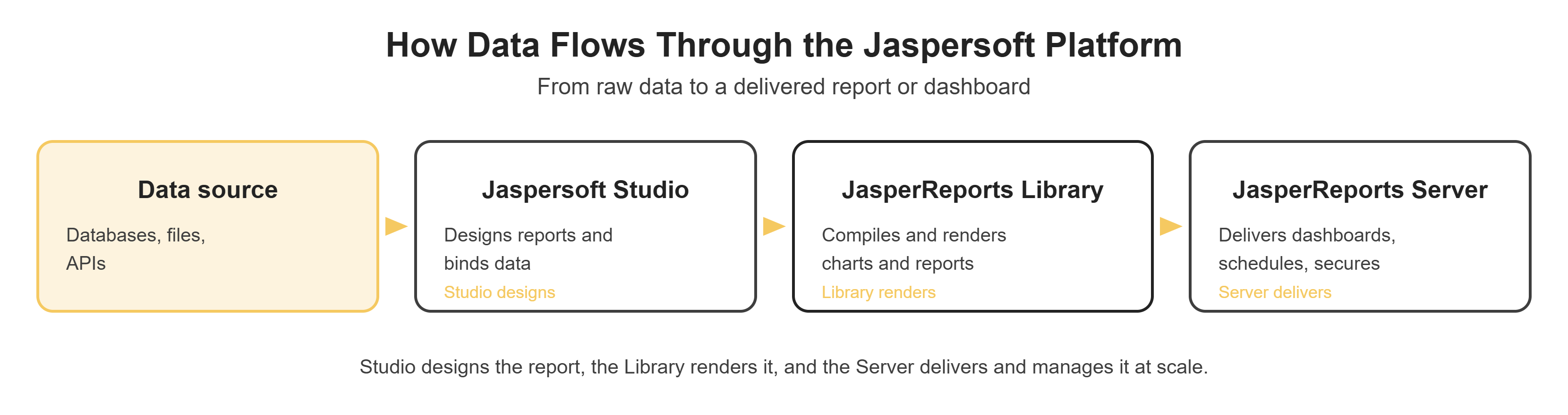
Jaspersoft is a family of components with different responsibilities. Don't treat them as interchangeable. Data flows from a source into Jaspersoft Studio, where it is designed; the JasperReports Library compiles and renders it; and JasperReports Server delivers it at scale (see the flow diagram shared earlier in this conversation).
- JasperReports Library: the core Java reporting engine. It compiles report definitions (JRXML) and renders the output, including charts, crosstabs, and tables, to formats such as PDF, HTML, XLSX, and Word. It is the foundation the other components build on.
- Jaspersoft Studio: the Eclipse-based visual design tool. Report developers use it to lay out reports and visualizations, bind them to data, and produce the JRXML that the Library executes. This is where visualizations are authored.
- JasperReports Server: the web application that stores, schedules, secures, and delivers reports at scale. It adds web-based capabilities such as dashboards, ad hoc self-service views, scheduled distribution, and runtime input controls that the design tool and engine alone do not provide.
Put simply: Studio designs, the Library renders, and the Server delivers and manages. Understanding this division helps set accurate expectations about where a given visualization capability lives and where an ETL and data integration layer needs to sit upstream to keep the data feeding these reports clean.
Open Source vs Commercial Edition
Jaspersoft's core, JasperReports Library and Jaspersoft Studio, is open source under LGPL, and building and running reports with them is free. JasperReports Server and its advanced visualization layer, including 35+ interactive HTML5 chart types built on Highcharts, geographic maps, ad hoc self-service, and visualize.js embedding, are part of TIBCO's commercial edition. Most enterprise-scale visualization work, meaning anything needing scheduling, dashboards, or embedding into another application, requires the commercial edition rather than the open-source baseline.
Why Enterprises Choose Jaspersoft for Data Visualization
Enterprises adopt Jaspersoft for reporting and visualization for several practical reasons:
- Better interpretation of complex data: visual encoding makes large or multidimensional datasets easier to read than tabular output alone.
- Interactive reporting: filters and input controls let users refine what they see without a developer rebuilding the report.
- Visual representation of KPIs and metrics: gauges, tiles, and summary charts surface the numbers leadership tracks.
- Drill-down and detailed analysis: where configured, users can navigate from a summary visualization to a supporting detailed report.
- Flexible report design: Jaspersoft supports pixel-perfect layouts and chart-driven analytics in the same document.
- Integration with enterprise data sources: it connects to relational databases, and commercial editions extend to a range of other sources, so visualizations run against governed enterprise data, often fed from a data lake consolidating multiple systems.
- Embeddable reporting: reports and visualizations can be surfaced inside other applications through visualize.js or REST APIs, rather than only in a standalone portal.
- Customizable requirements: layouts, formatting, and chart behavior can be tailored to specific reporting standards.
Jaspersoft Visualization Types: Charts, Maps, Dashboards, and Crosstabs
Jaspersoft supports several visualization families. Choosing the right one for the question being asked is central to good report design.
Charts
Charts are the most common visualization in Jaspersoft reports. The commercial edition includes over 35 interactive HTML5 chart types built on Highcharts. The table below maps each type to the kind of question it answers best:
| Chart Type | Best For | Example Use |
|---|---|---|
| Bar chart | Comparing a measure across categories | Revenue by product line for the current quarter |
| Line chart | Showing change over time | Monthly sales across the past twelve months |
| Pie chart | Parts of a whole, few categories | Revenue share by region |
| Area chart | Cumulative volume or trend over time | Cumulative units shipped by month |
| Scatter plot | Relationship between two measures | Marketing spend versus leads generated |
| Gauge chart | A single metric against a target | SLA compliance against a service-level goal |
Static versions of these chart types are available across editions, while the interactive HTML5 versions, with sorting, filtering, and on-the-fly formatting, are a commercial-edition feature powered by Highcharts. The right choice depends on both the analytical need and the edition in use. For teams comparing platforms before committing, our breakdown of QuickSight versus Tableau covers similar chart-type tradeoffs on other BI tools.
Maps
Maps visualize location-based data, shading or marking geographic areas by a measure so regional patterns stand out. A typical use is sales performance by country, state, or region, where a map immediately shows where performance is strong or weak in a way a table cannot. Map visualizations, including HTML5 map components, are available in the commercial edition.
Dashboards
Dashboards combine multiple components into a single interactive surface. A dashboard can bring together KPIs, charts, tables, filters, and input controls so that a change in one control updates the related components. Dashboards are a capability of JasperReports Server, built through a drag-and-drop web interface rather than requiring custom layout code.
Enterprise example. An executive sales dashboard might present revenue and margin KPI tiles at the top, a trend line for the year, a bar chart of revenue by region, and a table of top products, with period and region filters that refine every component at once, giving leadership one place to monitor performance. This pattern extends naturally into a full BI reports and dashboard build.
Crosstabs
Crosstabs (cross-tabulations) organize summarized data across rows and columns, aggregating a measure at each intersection. They are well suited to multidimensional comparison, for example, Region by Product by Revenue, where regions form the rows, products form the columns, and revenue is summarized in each cell.
Crosstabs complement charts rather than replacing them: a chart reveals the shape of the data quickly, while the crosstab beside it provides the precise summarized figures behind that shape. The crosstab is a report element available through Jaspersoft Studio and the JasperReports Library.
Drill-Down Visualization
Drill-down lets users move from a summarized visualization to progressively more detailed views, for example:
Sales by Region → Sales by State → Sales by City → Detailed Sales Report
It is important to be accurate about how this works. Jaspersoft charts do not all provide native drill-down automatically. Instead, chart elements and other components can be configured with hyperlinks or navigation actions that link to a more detailed report or view where supported. Runtime interactivity also depends on the output format and viewer: HTML output served through JasperReports Server supports interactive navigation that a static export does not. Designing these navigation paths deliberately is part of a visualization engagement, and it's the same discipline that matters in any report migration project that carries drill-down forward from a legacy tool such as Oracle BI Publisher.
Embedding and Distribution
Two commercial-edition capabilities that come up constantly in enterprise scoping conversations deserve their own explanation:
Embedding with visualize.js and REST APIs. Rather than sending users to a separate reporting portal, Jaspersoft reports and dashboards can be embedded directly inside another application's interface. Visualize.js is the JavaScript library built for this: it renders white-labeled charts and reports inside a host application and lets that application communicate bidirectionally with the embedded component, so a filter change in the host app can update the embedded chart. The REST APIs provide the same access for server-side integrations that do not need a JavaScript UI layer.
Scheduled distribution. JasperReports Server can run reports on a schedule and deliver them automatically by email or to an internal portal, without a user manually opening and exporting them. Combined with flexible export to PDF, Excel, HTML, and Word, this lets a recurring report, such as a weekly sales summary, reach a distribution list without manual intervention each cycle.
Implementing Jaspersoft Data Visualizations
A typical enterprise implementation follows a clear sequence:
- Identify requirements: define the reporting and visualization goals, the audience, and the questions each report or dashboard must answer.
- Connect to the data source: connect to the required database or data source that will feed the reports.
- Design in Jaspersoft Studio: lay out the reports and visualizations and bind them to the data.
- Configure visualization components: set up charts, tables, crosstabs, maps, and other components with the correct fields, categories, and measures.
- Add parameters, filters, and input controls: let users refine results at runtime.
- Configure drill-down or navigation: where required, add hyperlinks or navigation from summary visualizations to detailed reports.
- Publish through JasperReports Server: deploy reports and dashboards to the server for scheduling, security, scheduled distribution, and web delivery.
- Test accuracy, usability, and performance: validate that figures are correct, that the interface is clear, and that reports render within acceptable time.
- Deploy and maintain: roll the solution out to users and maintain it as data sources and requirements evolve.
Common Challenges in Jaspersoft Visualization
- Complex data structures: model or pre-aggregate the data, and use crosstabs and subdatasets to keep report logic manageable.
- Large datasets: push aggregation to the database and limit the rows a visualization has to process.
- Report performance: tune queries, remove unused variables, and avoid buffering entire result sets unnecessarily.
- Visualization design complexity: start from the question the report must answer and choose the simplest visual that answers it.
- Consistent formatting: use report templates and shared styles so every chart and table looks the same.
- Multiple data sources: consolidate or stage data where practical so a single report is not juggling many live connections.
- Drill-down configuration: plan navigation paths up front and configure hyperlinks consistently across reports.
- Dashboard usability: limit each dashboard to a clear purpose and a manageable number of components.
- Responsive requirements: test how visualizations render across the viewers and screen sizes your users actually use.
- Security and access control: use JasperReports Server roles and permissions to control who sees which reports and data.
Best Practices for Effective Jaspersoft Dashboards
- Keep dashboards focused: each dashboard should serve a specific business objective, not everything at once.
- Select the right visualization: match the chart type to the data and the question being asked.
- Avoid unnecessary charts: include a visualization only if it earns its place.
- Use consistent formatting: shared styles and templates make dashboards easier to read.
- Use meaningful KPIs: show the metrics decisions actually depend on.
- Provide useful filters: give users the controls they need to answer their own follow-up questions.
- Design logical drill-down paths: navigation should follow how users think about the data.
- Optimize queries and datasets: efficient data access keeps dashboards responsive.
- Consider performance: balance the number and complexity of components against load time.
- Make dashboards easy to understand: clear labels and titles reduce misinterpretation.
- Avoid visual clutter: white space and restraint improve comprehension more than density does.
Case Study: Enterprise Analytics Dashboard Delivery
Illustrative scenario. The following is an illustrative example, not an account of a specific customer engagement. No customer names, figures, or performance results are implied.
Consider an enterprise organization with large volumes of sales and operational data spread across multiple systems. Its users rely heavily on static reports and struggle to identify regional trends or drill into detailed performance because their reporting shows totals without an easy path to the underlying detail.
A Jaspersoft-based visualization solution could address this by introducing an executive dashboard that presents KPI visualizations for headline metrics, regional charts that make geographic patterns visible, and crosstabs that summarize performance across dimensions such as region and product. Filters and input controls would let users focus on a specific period or territory, and configured drill-down navigation would let them move from a regional summary to state-, city-, and finally transaction-level detailed reports.
In qualitative terms, the likely outcomes are that users spend less time hunting through static reports, regional trends become easier to spot, and analysts can investigate a number without waiting for a new report to be built, shifting the reporting experience from passive reading to active analysis. This kind of shift is a common outcome of a broader BI modernization initiative, and one that a BI service provider typically guides end-to-end.
At a Glance
- Jaspersoft data visualization services turn report data into charts, maps, crosstabs, and dashboards that make complex information faster to interpret and act on.
- Visualizations are authored in Jaspersoft Studio, rendered by the JasperReports Library, and delivered and managed through JasperReports Server, three components with distinct roles.
- The core Library and Studio are open source under LGPL; the interactive HTML5 charts (Highcharts), maps, ad hoc self-service, and visualize.js embedding are part of the commercial edition.
- Interactive analysis, including filters, input controls, and configured navigation, lets users move from summary views to detailed reports.
- Dashboards combine KPIs, charts, tables, and filters into a single interactive surface for enterprise reporting.
- Embedding through visualize.js or REST APIs, plus scheduled distribution to email or a portal, lets Jaspersoft reporting reach users outside a standalone portal.
Conclusion
Jaspersoft turns static reports into something people can actually act on: charts that show a trend at a glance, crosstabs that back it up with precise figures, and dashboards that bring both together with the filters users need. Getting there well depends on matching the right visualization to the right question, planning drill-down paths deliberately, and keeping performance and formatting consistent across reports.
With 17 years of experience and 400+ clients served, including any-to-any BI automation across Jaspersoft, Power BI, Tableau, and other platforms, DataTerrain helps enterprises design, build, and migrate Jaspersoft dashboards and reports that turn data into decisions.
Related Reading
BI Reports and Dashboard Development | From Any to Any: How BI Automation Simplifies Report Migration | Key Checklist for Successful BI Modernization | How Enterprises Can Benefit from Automated Shifts from Legacy BI to Modern BI | Difference Between Oracle BI Publisher and OTBI | Amazon QuickSight vs Tableau: Key Differences